Tuesday 30 September 2014

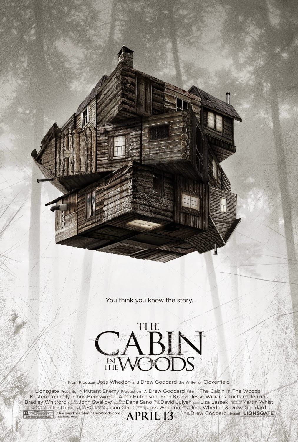
Analysis Of Horror Poster "The Cabin In The Woods".

This is a poster for the film "The Cabin In The Woods", which was released in 2011. The poster features a number of conventions that relate to my genre, which is Horror.


Below, I have listed the genre conventions of "The Cabin In The Woods":

  • Taglines, The Taglines on the poster speck directly to the audience, unsettle and disorientate them. In addition they offer a new take on the general conventions of the Horror genre. 
  • Iconography, The Image on the front of the poster gives of a sinister feel and aprear to me smudged and scratched. These conventions are often found on Horror posters, as they have a direct linked to the Horror genre. 
  • Setting, The poster does not reveal too much too much information in relation to genre, however, the cabin is isolated, which is a conventional feature of horror posters. In addition the abandoned cabin may suggest that the characters within the film will be isolated too. 
  • Colour Scheme, The colour scheme of the poster is dark and bleak. There appears to be a real absence of colour on this poster, this dark colour scheme is typical of horror movie posters.   
  • Effects, The poster appears to be scratched, giving it a chilling look. This is a similar to the last poster I anylsed 'Sinister', when the effects made the walls look as if they has been scratched.   

Analysis Of Horror Poster - "Sinister".

This is a poster for the film "Sinister", which was released in 2012. The poster features a number of conventions that relate to my genre.


Below, I have listed the genre conventions of "Sinister":

  • Iconography, Image behind the women is frightening and intimidating to the audience. The Blood behind the women is a clear indication of the films genre. The girl is isolated, 
  • Setting, The poster does not reveal too much information in relation to the genre, however the girl seems to be isolated, which is a common theme in horror films. 
  • Muted Colour Scheme, The scheme appears to be "Dark and Bleak", however, apart from the red, which is smeared on the walls. The dark red is a clear indication of 'Danger' and is a common colour used throughout horror posters. 
  • Tagline, The tagline directly addresses the audience; "Once you see him nothing can save you". This is a clear indication of the genre, as it is related to the theme of 'Death'. Death is a common theme used throughout 'Horror films'. 
  • Title, The font used for the title seems to be written in blood, which is sinister and unsettling. This is a common theme found in 'Horror' posters, which immediately indicated the audience with the genre. 
  •  Reference To Popular Films, The poster refers to films, that derive from the same producer. This is a convention of Horror movie posters, as the audience are familiar with these 'well established' movies, which draw them into watching 'Sinister'. 

Monday 29 September 2014

Genre anaylse of Posters.

As I have come to a final decision of what genre my film will be based on, my research and planning will be focused more specifically at the way the Horror' genre influences Posters, Magazine front covers and Teaser trailers.

Now, I am going to pick 'Six' posters from the 'Horror' genre and evaluate the specific iconography of the genre. In addition, throughout my research I will make a note of the ways that the 'Horror' genre is reflected through their conventions, such as taglines, Font used and colour schemes.


Below, I have written a list of the 'Six' movie posters I will be evaluating, in terms of their genre.


  • "Sinister".
  • "The Cabin Woods".
  • "The House At The End Of The Street". 
  • "The Possession". 


Saturday 27 September 2014

Research of Genre's.

Before I carry on anymore research and planning on my Poster, Front cover and Teaser Trailer of my movie, I need to make my final decision on which genre I will base my movie on.

As I have very little knowledge on movie genre's, in this post I am going to research a variety of different and diverse genre's. In addition, I am going to break each genre and give a brief overview. I will gather my research from a variety of different websites and books. The main website I used in this research is "FilmSite.org". Once I have a more detailed understanding of the different types of genres, I will be able to come to a more clear and better decision of which genre I should choose. 


Bellow, I have written a brief overview of the different types of Genre's I have found in my research. 

Action
Movies from the 'Action' genre, tend to be big budget Hollywood movies. Conventions from Action films usually include stunts, chases, rescues, destructive crises and non stop motion.


Comedy
Films from the genre of 'Comedy' are most often 'light-hearted' plots consistently and deliberately designed to amuse and provoke laughter. This is often done by exaggerating a situation, action and relationships between characters.


Horror
Films from the Horror genre are designed to frighten and invoke ones worst fears, often appearing in a terrifying and dramatic final. Horror films feature a wide range of styles, for example, the earliest silent Nosferatu, to todays CGI monsters and deranged humans. In addition, directors and editors from the Horror genre, have the access to a lot more resources and technology then compared to the classic Horror movies. Therefore, have a more of an impact and                                                                        effect on the viewers of today.

Science Fiction
The Science fiction genre is often visionary and imaginative. The conventions of this genre often include, heroes, aliens, distant planets, futuristic technology and unknowable forces. The 'Science fiction' genre has become increasing poplar in recent years, as shown in recent surveys.


Westerns
Western films are looked upon as the major defining of the American film industry. They are one of the oldest, most enduring genre, with very irreconcilable plots, elements and characters; such as Cowboys, Guns horses and dusty towns.


Now that I have carried out some detailed research on what genres are and given a brief understanding of each genre, I now believe that I able to make a major decision, to which genre my film will be based on. I am going to choose the genre of 'Horror', as I believe it is the most creative and interesting genre I have analysed. In addition, with the use of the programs and equipment I have available, to make the Horror genre stand out in my course work. I will continue my research and planning looking more specifically at the ways that the horror genre, influence posters, magazine front covers and teaser trailers. 

Monday 22 September 2014

Conclusion - Conventions Of Teaser Trailer.

Below I have written up a complete list of conventions I have found when analysing teaser trailers, in terms of their conventions. When creating my own teaser trailer, I will use as many of these conventions as I can, in order to make it look as authentic and realistic as possible.


  • Production Logo's (Usually appears at the beginning of the trailer). 
  • Rapid editing (Often Flashes, Dissolves and Quick flashes). 
  • Indication of Genre.
  • References to other Films that share established Producers/Directors). 
  • References to past awards that the cast and crew have won or been nominated for. 
  • Music reflecting the genre of the movie or to create tension or suspension. 
  • Credits of Cast, Crew and Directors - Normally appears towards the end of the trailer, However, can appears throughout the trailer. 
  • Taglines.
  • Sound Effects - Impact Sounds dominate. 
  • Variety Of Camera Shots/Movements. 
  • Reference To Source Material. 
  • Voice over - Often is included with Dialog from the movie. 
  • Eye Candy - This is often in the form of explosives and action. 
  • Link to Website - This usually appears at the end of the trailer. 
  • Title of the Film - This is often at the end of the trailer. 
  • Release Date - In a Teaser trailer, this is likely to be vague, such as "Coming soon" Or "This Summer" and usually appears at the end.  

Conventions Of Teaser Trailers - "The Wolf Of Wall Street"

The third trailer I am going to analyse in terms of conventions is 'The Wolf Of Wall Street', which is Bioptic Movie (A movie based on the life of actual person).


Below, I have made a list of all of the conventions I found in 'The Wolf Of Wall Street' teaser trailer:

  • Production company logo at the beginning of the trailer. 
  •  The editing is rapid and shots change quickly - short takes are used.
  • Contains a number of elements referring to the genre, 
  • Taglines. 
  • Names of producers.
  • Rapid music. 
  • Music builds up, building suspense. 
  • Release Date. 


Conventions Of Teaser Trailers - "Twilight Breaking Dawn"

The third trailer I am going to analyse in terms of conventions is 'Twilight Breaking Dawn', which is from the Romantic Drama genre.


Below, I have made a list of all of the conventions I found in 'Twilight Breaking Dawn' teaser trailer:

  • Logo Of Production Company at the beginning of the trailer. 
  • Rapid editing, including fades and dissolves. 
  • Rapid Music, gives indication to genre and builds suspense.
  • Sound effects.
  • Release date at the end. 

Conventions Of Teaser Trailers - "Monsters University"

The second trailer I am going to analyse in terms of conventions is 'Monsters University', which is from the children genre.


Below, I have made a list of all of the conventions I found in 'Monsters University' teaser trailer:

  • Production company logo at the start of the trailer.
  •  Slow shots are used to create tension at the beginning of the trailer. 
  • Scenes are longer then conventional teaser trailers. 
  • There is a release date at the ending of the trailer. 
  • Voiceover.
  • Includes impact sounds. 


Conventions Of Teaser Trailers - "Gravity "

The second trailer I am going to analyse in terms of conventions is 'Gravity' which is from the science fiction genre.


Below, I have made a list of all of the conventions I found in 'Gravity's' teaser trailer:

  • Production company logo at the beginning of the trailer. 
  • Impact and sound effects. 
  • Slow motion shots at the beginning of the trailer.
  • Rapid editing, including fades and dissolves. 
  • Rapid music indicates genre and creates tension. 
  • Release date at the end of the trailer. 


Conventions Of Teaser Trailers - "The Dictator"

The first trailer I am going to analyse in terms of conventions is 'The Dictator' which is from the comedy genre.


Below, I have made a list of all of the conventions in the teaser trailer of "The Dictator".

  • No production Logo.
  • Music reflects its genre, which is comedy.
  • Clear indication to the comedy genre, shown through clips of comedy through trailer. 
  • Eye Candy
  • Repeated use of taglines.
  • Includes Link To Website 
  • No  Release date.

Thursday 18 September 2014

Introduction To The Conventions Of Teaser trailers.

As I have now completed my research in terms of comparing theatrical and teaser trailers, in terms of their similarities and differences, I now need to focus specifically on teaser trailers, as this is the form of trailer I will produce for my final task.

In order to make my teaser trailer feel as authentic and realistic as real teaser trailers, I need to include existing conventions. As I have very little knowledge on the conventions of teaser trailers, I am going to analyse 6 teasers trailer, in order to have a more detailed understanding of their conventions. I will choose teaser trailers from different genres as I want to identify the conventions that are particularly to a type of trailer. Throughout my research, of the conventions of teaser trailers I will make a list of all the conventions so that I can use them when creating my teaser trailer, in order to make it feel more authentic and realistic.


Wednesday 17 September 2014

Comparison of Teaser Trailer and Theatrical trailer for "Marvel's Avengers"

Below I have attached both a 'Teaser' trailer and a 'Theatrical' trailer for "Marvel's Avengers".

Teaser trailer:


Theatrical trailer:


  • The first similarity between the two trailers is revealed at the beginning of both clips. They both share the use of abstract shots, of buildings and large landscapes. However, a difference between the two types of trailers is that these abstract shots are more common in 'Theatrical trailers', than in teaser 'Trailers'.

  • The second similarity I cam across in both Teaser and Theatrical trailer was in terms of its editing. Both types of trailers had the use of fades throughout the clips. However, a noticeable difference was the speed of the fades. The teaser trailer had rapid fades, whereas the theatrical trailer had slower fades. Another difference I noticed in terms of editing was the use of 'Slow motion' shots. This was only used in the theatrical trailers and not in the teaser trailers.

  • A clear similarity of both teaser and theatrical trailer is that they both contain a production company logo. However, a noticeable difference between the two is that the logo appears on the screen for a shorter amount of time in the teaser trailer than the theatrical trailer. 

  • In addition, I noticed that both types of trailers contained extracts of music. However, a noticable difference between the two types of trailers, in term of music, is that the teaser trailer started with music. Whereas, the theatrical trailer took time to play music. Another noticeable difference in both types of trailers, is the types of music used. The teaser trailer contained more dramatic and upbeat music, creating more tension than the theatrical trailer.

  • Once again, both types of trailers contained similarities in terms of effects. In both the teaser and theatrical trailer there was eye-candy, for example explosives. However, a clear difference between the two types of trailers, was that the teaser trailer contained more eye candy in proportion to the theatrical trailer. This may be because the theatrical trailer focuses on the general development of character and story line.


Comparison of Teaser Trailer and Theatrical trailer for "Fast and Furious 6"

Below I have attached both a 'Teaser' trailer and a 'Theatrical' trailer for Fast and Furious 6".

Teaser trailer:


Theatrical trailer:


  • The first similarity I had found in both teaser trailer and theatrical trailer of 'Fast and Furious 6', was that they both contain a production company logo. However, a noticeable difference between the two is that the logo appears on the screen for a shorter amount of time in the teaser trailer than the theatrical trailer.

  • The second similarity I notice between the two different types of trailers was both of them containing narrative of the film. However, a noticeable difference was the teaser trailer delivering less narrative, whereas the theatrical trailer gave the audience more detail of the story line.

  • In addition, both teaser trailer and theatrical trailer contained elements of editing. Both types of trailers had the use of fades through the clip. However, a noticeable difference between the two types of trailers was the difference in speed of the fades. I noticed this as the teaser trailers faded much quicker than the theatrical trailer.

  • The last similarity which stood out to me was in terms of effects. Both types of trailers contained elements of effects, such as eye-candy (fast cars, attractive looking women, explosives and chases). However, a clear difference between the two, was that the teaser trailer contained more eye candy in proportion to the theatrical trailer. This may be because the theatrical trailer focuses on a general development of character and story line. 


Comparing different types of trailers - Comparison

As well as producing a poster and magazine cover for my final task, I will create and edit a teaser trailer for my imaginary film. As I have not come to final decision of the genre of my film, I will focus my research on the similarities and difference of teaser trailers and conventional theatrical trailers. I will be looking at two films, "Fast and Furious 6" & "Marvel Avengers", which both have teaser and conventional theatrical trailers.


Tuesday 16 September 2014

Conventions of Magazine front covers.

For my final task, of my A2 project, one of the things I have to produce is a magazine front cover. 
As I had very little knowledge in the basic conventions of magazine front cover, I carried out detailed analysis on magazine publications, in terms of their conventions. As well as wanting to know the conventions of magazine covers, I also wanted to know if magazines targeted at divorce audiences shared the same conventions. As revealed in my research, magazine covers tend to share basic conventions, regardless of the type of publication and the audience. However, certain elements of the front cover change as a result of the audience the magazine is aimed at. 

Below, I have attached a the following conventions that appear in all film publications; 


Masthead


The Masthead is usually the biggest font on the page and in a colour that stands out from the background. 


                                                            Cover Lines


In mainstream magazine (Left), the cover lines usually refer to big budget Hollywood films or recognisable Actors. Whereas independent magazines refer to lower budget films and more obscure actors and directors. 


Banner


Dominant central image


In a mainstream magazine there is usually an image of an A-list star or recognisable character. Whereas, an independent film magazine (Left) often includes an image of a director or a less reconisbale actor. 


Barcode


Price, date and issue number


Slogan


Website


'HotDog' magazine cover.

The last magazine cover I am going to analyse in terms of its conventions is 'Hotdog'. This market is targeted at the cynical view of the movie industry. The magazine includes a mashead, slogan, banner, cover lines, barcode and dominant central image of a reconcilable star or character from a Hollywood movie. The colour scheme of the magazine suggest that it is focused at the mainstream Hollywood movies.


'Movie Maker' Magazine cover

Movie Maker is a magazine targeted at a niche target audience; those who specialise in producing movies. Therefore, this magazine will have no interest to the general public. The magazine includes a mashead, slogan, a banner, cover lines, barcode and dominant central image of a reconcilable star or character from a Hollywood movie.  The colour scheme of the magazine suggests the magazine is targeted at more sophisticated audience, then a mainstream movie magazine.


Monday 15 September 2014

'Empire' Magazine Cover.

The third magazine I am going to analyse in terms of its conventions, is British biggest selling magazine 'Empire'. The cover includes prominent, brightly coloured masthead, slogan, a banner, cover lines, barcode and dominant central image of a reconcilable star or character from a Hollywood movie.  


'Neon' Magazine cover.

The second magazine I am going to analyse in terms of its conventions is Neon. The cover includes a Mashead, Slogan, Banner, Cover lines, Barcode and a dominant central image of a reconcilable star or character for a Hollywood movie.  The colour scheme includes bright and light elements, suggesting that the magazine is targeting two different audiences. The two audiences are both main stream and independent/cult film audiences. 


'Sight & Sound' Magazine Cover

In this post I am going to anayle a poster from 'Sight & Sound'.  Despite being an independent magazine, it still contains the same conventions as a cover from Empire.  When compared to a mainstream magazine, such as Empire, a clear difference between the two is on the front. The image on the front of a Sight and Sound magazine tends to be of a director or editor of the film being review. Whereas, when compared to the Empire, the front of the magazine tends to be of a irreconcilable character or star. This can therefore, suggest that despite the two magazine covers including the same conventions, the magazine is aimed completely at a different audience. This point is also reinforced through the colour scheme of the two magazines. The colour scheme of 'Sight & Sound' has a more serious tone, making the cover seem more sophisticated, which is suits the target audience of the magazine.

Introduction to magazine front covers.

Having analysed a number of magazine publication, ranging from different genres, I am now going to analyse how magazine conventions differ depending on the target audience. As a result highlighting these conventions, I would use later on in my project, when making my own poster. This would result to my looking more authentic and realistic.

I am going to be looking a range of different magazine covers, in order to see if its conventions vary depending on its target audience. I will be anylising its conventions in terms of layout, style and content.

These magazine include;

  • Sight & Sound
  • Neon
  • Empire
  • Movie Maker
  • HotDog


As as a result of not coming to a final decision on my genre. My research and planning will now be focused on magazine front covers, as I will be creating and designing my very own, later in the project.

Sunday 14 September 2014

Conclusion To Existing Film Publications

                             
After looking at a wide range of existing film front covers, my research has shown that there are many different film publication, which set out to cater to a wide range of different audiences.  The main use of these magazines are there to help promote forthcoming films, however, the types of films that are promoted often change depending on the type of magazine. Above, is a perfect example of how some magazines set out to largely promote mainstream Hollywood films (Empire), whilst other magazines promoted British or independent films (Sight & Sound).


Below, I have attached an example of two magazine front covers.


When comparing a magazine such as Sight & Sound to a magazine such as Empire, it clear contrast is shown through the content of the magazine. Sight & Sound compare limited releases, where as main stream magazine such as Empire, review big budged Hollywood movies. As a result of this dramatic different, it means the audience is different. This can be shown as Sight and Sound targets a more sophisticated audience, when compared to a magazine such as Empire. This point is reinforced by the cover of the magazine; often an image of the Director. However, when compared to a general magazine, such as Empire, they usually have an image of the actor or character of the movie.

Wednesday 10 September 2014

Existing film publication

In this post I will list 20 existing film publications, with a brief analysis of content, style and its targeted audience. This is beneficial as it will give me a basic understanding of the conventions used in a existing film publications. In addition, this research will be beneficial later on in my project when designing my own magazine front cover, as I will use all the existing conventions to make my front cover look more realistic and authentic. This research was also helpful as it allowed me to think about the most appropriate type of magazine that would promote my film.

The magazine I choose to help promote my film, will depend on the following factors; audience. whether or not the film is mainstream (Big blockbuster) or an independent and the genre of the film.


Empire is a British magazine which it currently the biggest selling magazine in Britain. Empire's target audience is focused between 15-24 years. The magazine is published monthly and is also released in America, Australia, Turkey. Russia and Portugal. Empire also organised the annual 'Empire year awards', which are voted by readers. Movies and interviews discussed in this magazine, tend to main be mainstream Hollywood Blockbuster movies, as this is the main interest of its demographic audience.


Cinefax is one of the first special effects magazines to be published. The magazine is aimed at a niche audience; being the special effect industry. The magazine includes exclusive clips of up coming movies and detailed  articles on what features will appear in the films.
.


Premiere is American magazine which is targeted at mainstream big budged movies. The magazine was first established in France in 1976 and was named 'Premie're'. The magazine has now become one of the biggest sellers including unseen footage and a spotlight on "hot"screenwriters.


American Cinematographer is another example of a magazine directed at a niche audience. The magazine focuses on the arts and crafts of cinematography. It includes in-depth interviews cinematographers, directors and specialist in the industry. This magazine's entire focus is on the arts of cinematography and even includes historical articles and information of the technology that impact elements of the craft/art.


'Bright Lights' is an online magazine, week publishes weekly. These issues can be accessed through tables or mobile phones. Online magazines are becoming increasingly popular as they a more economical and accessible for the consumer.


Sight & Sound is magazine which's primary focus is film reviews. The magazine releases a monthly issue on new releases and upcoming releases. Sight & Sound also reviews limited released, that are shown in Art Houses; these films tend to be specialized in arts, rather than for entertainment. This magazine clearly targets a more sophisticated audience, compared to a general movie review magazine. This point is reinforced by the cover of the magazine; often an image of the Director. The magazine includes a full cast and crew list of each film reviewed.


Noen is targets a more broad and diverce audience. Whilst the magazine including big budget film reviews, actor profiles, interviews and contemporary movie profiles (Written with a sense of humor), it also features a variety of classic and cult films.


Hotdog is targeted towards the cynical view of the industry, especially Hollywood. It is debated that in recent years the magazine has moved more towards the mainstream film press. Nevertheless, HotDod is known for its interest in publishing pieces which appeared to contrary the audiences general opinion.


Shivers is another example of a British magazine. Its primary focus is the horror genre. Shivers does not only review films, it also reviews Television programs, and literature. Shivers also covers featured contemporary horror films.


Cineaste is written and published in New York. The magazine is published quarterly, rather than weekly or monthly. It includes in-depth analysis and interviews of general releases. It does not only review movies, but also television shows.


Total Film is another example of a British film magazine, first published in 1997 and is published 13 times a year. The magazine offers film, DVD and blue-ray news, reviews and additional feature.  It is the second biggest selling film magazine in Britain, after Empire. The cover normally includes a character from a big Hollywood release, or reconcilable star.


 Film Review first started as a promotional magazine for ABC circuit. The magazine became a success and was a popular monthly magazine featuring news, pictorials , literate reviews and information. For nearly sixty years it was one of the most appealing publications for films. It covered a wide range genres and styles of films.


Movie Maker is an American film magazine. It is primary focus is on the arts and business of making movies, with attention to independent films. It includes featured articles movie making techniques, trends, technology and product updates. The cover often features an image of a director or actor (outside of the mainstream industry).


Femme Fatales is a magazine targeted at men in particular, focusing on films and television actresses. It is mainly directed at science fiction, fancy dress and horror actresses. The magazine includes interviews with the actresses and directors. The cover of the magazine normally includes an acress in character.


Scarelet Street is an American published magazine that specialized in the genre of horror and mystery. The magazine includes interviews and exclusive information regarding the horror genre.


Mad monster is another American published magazine. This magazine is also based on the horror genre. Mad monster also features interviews and exclusive information. However, targets to a younger audience, this is shown as it includes puzzles and games.


 Screen International is a multi-media magazine that focuses on international cinema. The weekly published magazine is aimed at people who work within the cinema industry, rather than the general public. The company of the magazine also produces publication at film festivals.


Starburst is a another example of a British film publication. It is aimed at the science fiction genre. The magazine published monthly issues with additional news and reviews being published daily on the website. The magazine contains news, interviews and reviews specifically on the genre. One of the main uses of the magazine is to help promote forthcoming releases of films and TV shows in the genre.


Little White Lies is another example of an independent British published magazine. The magazine features writings, illustrations and photography related to the cinema. The content of the magazine is split into six sections; the lead review, an editorial introduction, a series of articles inspired by the featured film, theatrical reviews and last section focuses on new releases.